UX Design Case Study | Nacho Mama Food Truck: Concept App

Nacho Mama's Food Truck App is a concept app created during my study for Google's UX Certification course, it is designed to help users quickly order meals and schedule pick up from Nacho Mama Food Truck.
My Role
Graphic Designer, UX/UI Designer, Researcher
Tools Used
Figma, Adobe Photoshop, Adobe Illustrator, Google Suite
What I Did
Branding, Competitive Analysis, User Research, Information Architecture, Mobile App Design, Prototyping, Usability Testing, UI Kit Design
Video: User Flow of Nacho Mama Food Truck App Prototype
Design Process


Empathize
-
The best way to understand the needs and motivations of users is by listening to them. I interviewed five working adults aged between 23 and 65 years, who have varying levels of experience with ordering meals online.
The participants' interview responses can be summarized as the following:
• 5 out of 5 participants said they would prefer to order a meal for pick up through an app/website over other methods (calling or in-person).
• 4 out of 5 participants have previously scheduled a meal for future pick-up through an app/website.
• 4 out of 5 participants have previously experienced frustration when using a meal ordering platform.
• 1 participant with food allergies said listed allergens are important to them.text goes here

Competitive Analysis
Before jumping into the process of creating my solution, I evaluated 3 food trucks in the Bozeman, MT area. I interacted with their websites and online ordering processes. This helped me identify gaps and opportunities for an online ordering experience.
-
Three major pain points were identified during foundational research:
Time
Working are often too busy to spend time prepping meals on busy evenings.Ease of Use
Many food ordering platforms can be difficult to use. Users with limited digital literacy often struggle to place an order.Allergens
Many food ordering apps do not clearly list food allergens on the menu.
Define
User Persona & Journey
Based on the insights from foundational research, I developed a persona whose demographics, motivations, goals, and frustrations represent the needs of users. Meet Kay. Mapping Kay’s user journey revealed areas of improvement for a better user experience.


-
Through research I knew the problems and frustrations faced by users. Two "How Might We" problem statements were created to ensure a problem-solution fit for the proposed app.
How might we make scheduling meals more enjoyable for customers?
How might we reduce time spent reviewing ingredients and allergens for concerned users?
User Flow
To create a user-centered design, I first mapped an ordering/checkout user flow. I prioritized recognition over recall to promote the most intuitive user experience (i.e. Guest Checkout).

Ideate
Brainstorming: Wireframe Sketches, Site Planning, and Design Elements
After considering Information Architecture, I conceptualized a minimum of five options for each screen. After combining the best solutions into a single wireframe, I began creating digital wireframes in Figma.

Low-Fi Prototyping & Testing
Focusing on navigation and the main user flow of ordering a meal, I designed a simple clickable prototype of the app.
Click to interact with the Low-Fi Prototype


Usability Test (Round 1)
The low-fi prototype was tested in an unmoderated usability study with 5 participants. Participants were asked to create and complete an order, then filled out a System Usability Survey (SUS) assess their experience with the prototype. I was testing clarity and comprehension of the app flow. I evaluated the study results with an affinity diagram, taking both positive and negative feedback into consideration. Here are the study results:
-
• Every participant successfully completed the tasks
• Overall straightforward flow and easy to use
• Font sizes are easily readable
• Icons made instructions obvious
-
• Some participants were unsure of which feature to use when starting an order (Order or Menu)
• Constraint settings within Figma were causing participants to see inconsistent views

Affinity Diagram of usability test results.
Iterations
Based on the usability study results, I updated the bottom navigation to focus on the main user flows. I began refining the design mock ups and making necessary edits:
Removed the "Account" button from the bottom navigation (placed within "More")
Changed the "Order" button label to "Pre-order"
The icon for the "Pre-Order" button was updated, increasing clarity
All of the constraints in Figma were updated, creating a consistent viewing experience across devices


Hi-Fi Prototype
Refining the Design
With the initial usability issues addressed, I continued to refine the mockups, creating a UI Kit to keep design elements consistent. I sent my mock ups to designers and potential users, seeking critique and feedback throughout the design process.


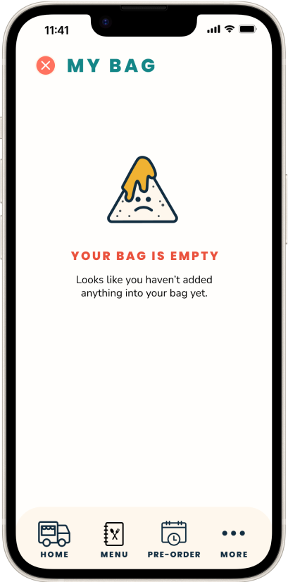


High-Fidelity Prototype
Once I was confident in the mock ups and flow, I began prototyping in Figma.

Screenshot of prototype connections in Figma.
Testing & Iterations
Usability Testing (Round 2)
Another round of usability testing was conducted, this time using the hi-fi prototype. I interviewed 5 participants in a remote moderated usability study followed by a series of rating questions (1-10 scale).
By testing the design at this stage, I could observe an interaction that most closely resembles a real-life interaction with the final product. I noted and measured if participants understood the app and how to complete tasks; completing an order from start to finish, viewing their bag, and scheduling a future order.
Insights
Insights from the usability test yielded a majority of positive feedback, but showed a few areas with opportunities for improvement.
-
• "Super readable and clean design" -Participant
• Ability to "favorite" items
• 5/5 participants felt the app was easy to use (rated 10/10)
• 4/5 participants felt very confident using the system (rated 9+ out of 10)
-
• Some participants had trouble finding or viewing the View Bag button on Menu screen
• Participants expected more interaction when "Add to Bag" was clicked
• 1 participant was confused by the downward navigational arrows
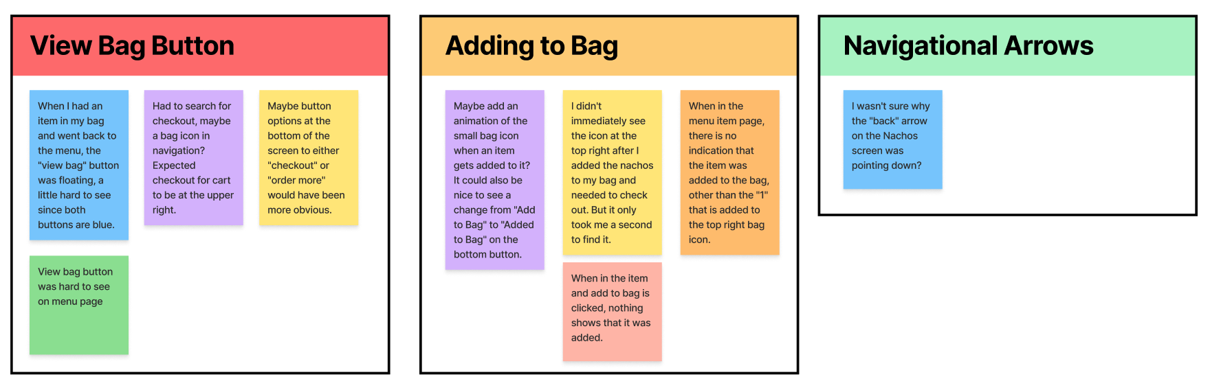
Affinity diagram of 2nd round usability test results.
Iterations
Thanks to the usability test, I was able to define three challenges within the prototype. Here are my solutions:
Solution #1
Add contrast to the "View Bag" button.

Before (Left)
The "View Bag" and "Add to Bag" buttons were too similar in color. Some participants had a hard time finding the button.
After (Right)
I changed the button color to the secondary yellow in the style guide, creating adequate contrast. I also added an alternate "View Bag" button to the top of the menu page.
Solution #2
Increase interaction when adding an item to bag.
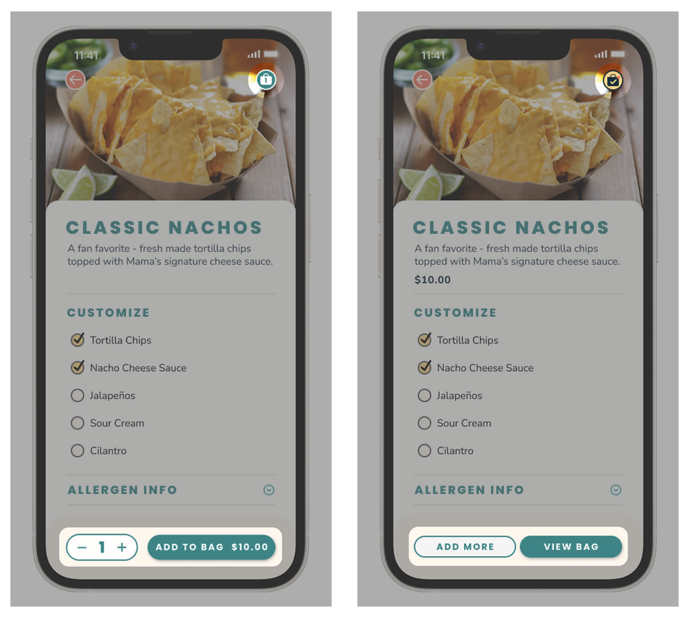
Before (Left)
Participants expressed they expect more interaction when adding an item to their bag. In this version only the number on the bag icon updates.
After (Right)
To address this issue, once an item is added to the bag the bag button at the top of screen shows a checkmark and red notification. The buttons on the bottom navigation update to guide the user to View Bag (checkout) or Add More (back to the menu).
Solution #3
Updating navigational arrows for clarity.
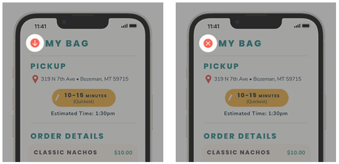
Before (Left)
Although only one participant expressed hesitation with the down arrow to close the "My Bag" screen, I knew that this may cause some friction for future users.
After (Right)
To alleviate any confusion, I updated all of the downward arrows to a more standardized exit button.
Visual Design
Style Guide / UI Kit
Nacho Mama Food Truck is a fun, inviting, family-friendly brand. Brand colors are used to help users navigate the app. UI elements and typography are kept simple and streamlined by using familiar UI patterns.
I developed the Style Guide before iterating on the hi-fi mockups to increase consistently throughout the design.


Final Design
Accessibility Considerations
My goal was to create a design that considers a wide range of human diversity. I wanted a similar user experience for every user, regardless of their digital literacy or past experience.
• All text/background color combinations pass WebAIM contrast accessibility standards.
• Icons accompanied with text are used throughout the design to direct users to the appropriate actions.
• All ingredients and allergens are listed on each menu item page, allowing users with concerns access to transparent information.
Final Prototype
The Nacho Mama Food Truck final prototype allows users to experience the app. Give it a try!
Future Considerations & Past Reflections
Future Considerations
The next step in the project's process is to conduct another round of usability studies with a wider range of participants to determine if the current solution effectively addresses the user's pain points. Once ready to build, hand off to development engineers.
Future Considerations:
• Create a customer loyalty program, allowing users to see their status.
• Ability to search the menu via search bar
• Language translation features
• Featured items and deals on the menu
Reflections: What I Learned
The Design Process is NOT Linear
A design is never finished. Continual testing and iterations are necessary to maintain a relevant, user-centered product.
User Testing is Key
Testing a product with real users gives a new perspective. Through my moderated usability studies, I was reminded that each individual is unique. The best way to learn about the usability of a product is by testing it with a wide variety of people.
Prototyping
During the final design, I realized how time consuming but important high-fidelity prototyping is. Adding micro-interactions had a great impact on the whole look, feel, and identity of the app.
I did that! 💪
Being the sole UX/UI designer for this project had its challenges. Using both my previous design experience and a plethora of recently learned skills, I created a visually appealing user-centered product. I'm really proud of the research, development, and designs that I completed for this project.